- Published on
Track Your Time Effectively and Easily Using Google Sheets or Excel
- Authors
- Name
The first step in time management is to assess yourself. Meaning, track how and where you spend your time. I was reading one of Harvard Business Review's publication called Managing Time, which walks us through the tips for good time management. It talks about how being self-aware of our habits and where we spend our time will help us achieve better management and utilisation of time. This article shows how you can very easily use a spreasheet (like Google Sheets or MS Excel) to track your time however you want (instead of relying on an app which might not provide what you really want to achieve).
1. Divide your responsibilities into categories
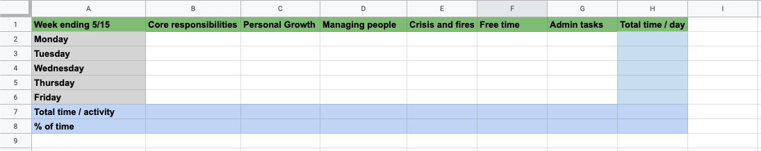
- In the first column, write down the days for a given week [Mon, Tues, ...Fri], (start writing from 2nd row, ie Row 2)
- In the first row, write down the different categories [Core Responsibility, Free time, ...Personal Growth], [start writing from the 2nd column, from Column B].
- For each cell corresponding to a particular row and column, you'll fill up the total hours spent for that day in that category. (Just keep on updating the values as you work through the day)
- We'll create an additional column in the end which sums up the total hours in a day, across all categories. You will not need to manually sum and calculate this value. We'll let the spreadsheet do that for us.
Create the additional column in the rightmost end (with heading 'Total time / day' in the first row). Select the first cell for that column (ie, of Monday row) and edit the formula bar to make it sum up all the cells in that row. The format of sum formula is=Sum(Cell1:Cell2). It will sum up all the cells from Cell1 to Cell2. A cell is represented by the column alphabet and row number - for eg.B2,C11, etc. Hence, in your formula bar, you could write=Sum(B2:G2)- this will sum up all the cells from B2 to G2 - which should be the sum of all hours for Monday.
Now, to write the formulas for the rest of the cells in that column, simply select and copy the one cell whose formula you've written, and paste to rest of the cells. Google Sheets will automatically update the formula for each cell to sum of the corresponding rows.
Hence, you don't need to manually write the formula for all the cells. Just writing for one will do. - Next, we'll create a row in the last which sums up all the hours spent in each category for the week.
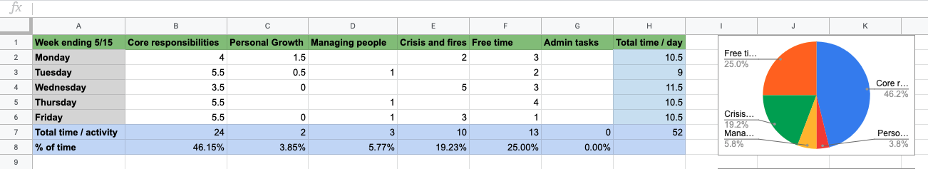
Create the row (with name Total time / activity in the first column). In the next cell of this row, write the formula to sum up all the cells in that column (For eg=SUM(B2:B6)). Copy paste the cell to rest of the cells in that row. You should have correct sum formulas for each cell in that row (including cell of 'Total time / day' column in that row). - Let's create one more row in the end which shows the % of time spent in each category for the week.
Create the row in the last named % of time. Its cell should have the formula: total-time-in-category divided by total-hours-spent-in-the-week. For eg. the formula for first category would look like=B7/H7. Copy paste the cell to all cell of the rows.
You should have your time sheet ready for a particular week. Just update the values for each cell corresponding to different days and category throuout. Spreadsheet will automatically calculate sums and percentages accordingly.
You can highlight the heading cells with different colours, to make it look better. Something like:
Creating time sheet table for the next week:
You don't need to manually create the table for the next week. Just copy the entire table created above (select all cells including heading), and paste below the table. Google Sheets will automatically udpate its sum and percentage formulas according to this new table cells positions.
Now, you can quickly create the time sheet table for new weeks instantly
Creating the pie-chart for each time sheet table
To create charts in excel, you just have to select the rows and columns and do Insert -> Chart.
However, for our table, we need to create the pie chart of just the % values for each category. To do that:
- Select all the category heading cells (Personal Growth, etc.) and all the percentage value cells (51.11%, etc). You can select the different cells holding the Cmd (Mac) or Ctrl (windows) or Windows key (Linux) and clicking on the cell.
- Go to Insert -> Chart
- An irregular bar chart might show up, we'll change it to proper pie chart
- Double-click the chart to open chart options on the right.
- Change chart type to Pie
- Under Combine Ranges, select Vertically
- Select Switch rows / columns checkbox.
You should see a proper pie chart of your time spent in different categories in the week with the labels.
For the time sheets of different weeks, you'll have to make the pie charts for each separately following the same steps above.
Well, that't pretty much it. It might look hefty at first, but as said, gets quite quick and easy once you get going with this.
On top of that, you'll be able to:
- Visualize where and how much you spend your time
- Take action on it. Do better planning and take out more time for personal growth.
- Change your life.....in some way or other mostly.
That's all. Leave a comment if any thoughts or issues.
Cheers!